Kitchen Respray Colours 2026: What Actually Lasts
The best kitchen respray colour in 2026 is not the one that looks good for ten seconds on Instagram. It is the one that still suits the room, the worktops, the flooring and the way the kitchen is used after the novelty has worn off.
Revitalize Resprays sees the same pattern across Manchester, Stockport, Tameside, Cheshire and the North West: most kitchens being considered for a respray are structurally usable, but the colour has dated. Cream gloss, orange-toned wood, dark brown doors, yellowed whites and tired shaker finishes can make a good kitchen feel older than it is.
Quick answer: what colour should you respray your kitchen?
Start with the room, not the trend. A colour that looks premium in a large bright kitchen can feel heavy in a smaller room with limited natural light. A colour that looks safe on a flat sample can look cold once it is against your worktops, floor tiles and wall colour.
Bryan's practical rule is simple: choose a colour that solves the actual problem. If the kitchen feels dark, do not make it darker just because a colour is fashionable. If the kitchen feels bland but has good light and strong worktops, a deeper colour can make it feel intentional and premium.
The best respray changes the feel of the room without fighting everything around it. That is why Revitalize asks for photos before giving advice. The doors matter, but so do the worktops, splashback, flooring, handles, wall colour and natural light.
Kitchen colours that keep working after the trend passes
The safest colours are not boring. They are the colours that make the kitchen feel fresh without becoming too personal. These tend to work well for homeowners staying long term and for people improving a kitchen before selling.
- Warm whites and off-whites: good for brightening tired kitchens without the harsh look of a cold white.
- Taupe, stone and greige: useful when the kitchen needs to feel warmer and more premium but still neutral.
- Soft sage and muted green: strong for shaker kitchens, oak-toned floors and homes that need a softer modern finish.
- Light grey with caution: still usable in the right room, but avoid flat, cold greys that make the kitchen feel dated again.
If you might sell the house, this group is usually safer than a very bold colour. The kitchen needs to photograph well, feel clean on a viewing and avoid making the next buyer think they need to change it again.
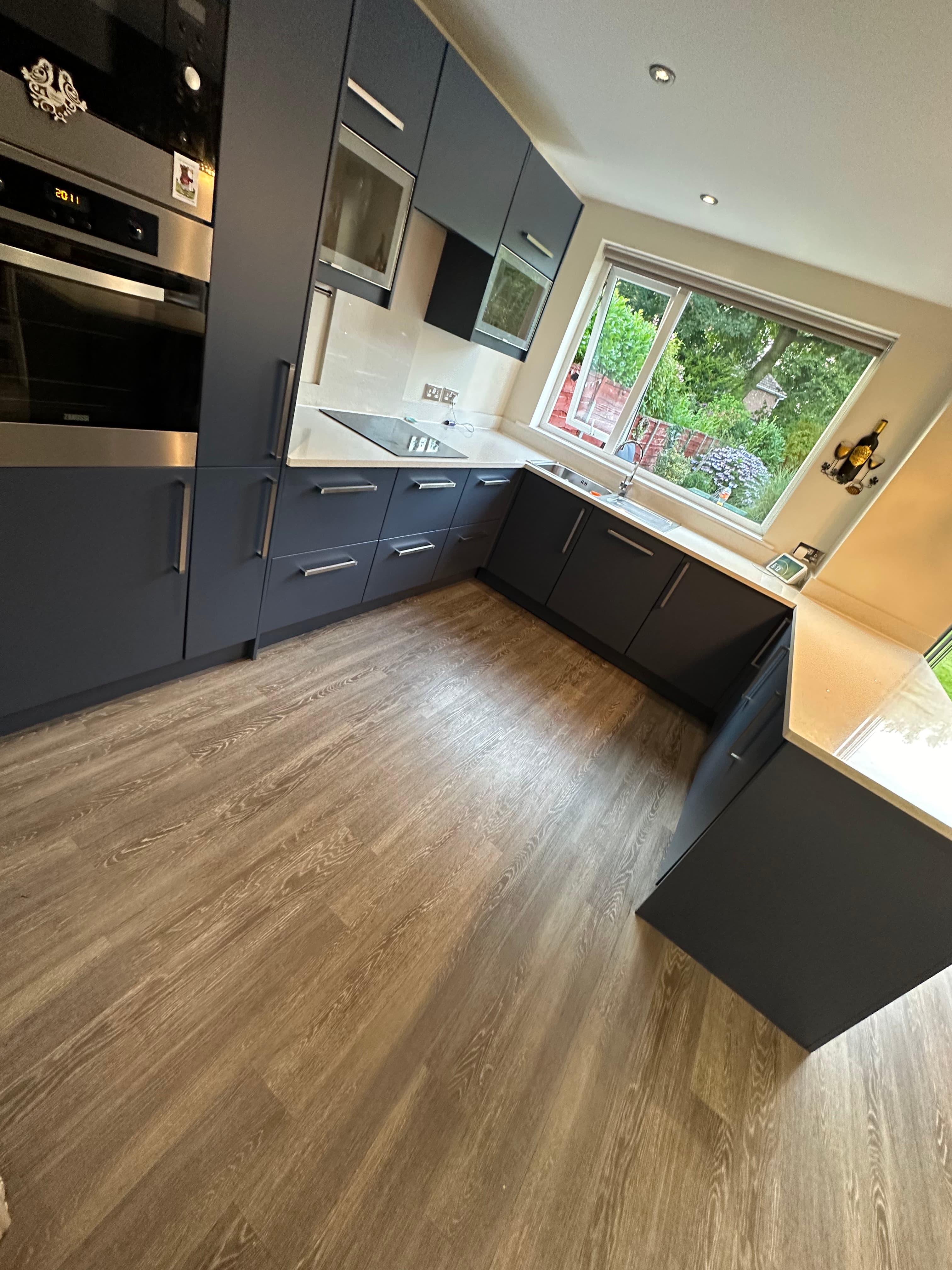
When navy, charcoal, graphite and rich greens work
Strong colours can look excellent on a resprayed kitchen, but they need a room that can carry them. Deep navy, charcoal, graphite and richer greens often work best when the kitchen has enough daylight, lighter worktops or flooring, and handles that lift the finish rather than flatten it.
The mistake is choosing a dark colour because it looked good on a large showroom kitchen, then applying it to a smaller room with dark worktops and poor light. The same colour can look premium in one room and heavy in another.
A stronger colour is usually a better choice when the homeowner is staying in the property and wants the kitchen to feel deliberately designed. For a quick sale, a more neutral shade may be the cleaner commercial decision.
Match the colour to the light, worktops and flooring
Kitchen doors are only one part of the picture. A colour sits next to the worktop all day. It sits above the floor. It reflects the wall colour. It changes between morning light, evening light and artificial lighting.
That is why a paint card can mislead people. A shade that looks warm in a shop or on a phone can look cooler at home. A colour with green undertones can pull differently against cream tiles, oak floors or black worktops.
Before committing, look at the colour in the actual kitchen. If possible, test a sample against the worktop and view it in different light. It is a small step that can prevent an expensive change of mind.
Matt, satin, gloss and sheen levels
Colour is only half the decision. The sheen changes how that colour feels. Matt and low-sheen finishes can look softer and more modern. Satin gives a practical middle ground. Gloss reflects more light but can also show more of the room back at you.
Revitalize can match finishes including matt, satin, gloss, eggshell and percentage sheen levels such as 10, 20, 30 or 40 percent. That matters because two doors in the same colour can look different if one is flatter and the other is more reflective.
For many modern kitchen resprays, a controlled lower-sheen or satin finish gives the most balanced result. It looks premium without trying to mimic a high-street gloss door.
Farrow and Ball, RAL, Little Greene and physical samples
Revitalize can match almost any colour, including Farrow and Ball, Dulux, RAL, Little Greene, Craig and Rose, Benjamin Moore and physical colour samples. If you have seen a colour elsewhere but do not know the name, Bryan can often work from a sample rather than forcing you into a standard kitchen range.
The coating system still matters. A kitchen respray should not be treated like brushing wall paint onto doors. Revitalize uses a professional wood finishing process, proper preparation and sprayed top coats so the finish is built for kitchen use.
That is the difference between choosing a colour and getting a finished kitchen. The colour gets the attention, but the preparation and coating system decide whether the job still looks right after daily use.
Colour mistakes to avoid before a kitchen respray
- Choosing from a phone photo without checking the colour in your own kitchen light.
- Going too dark in a room that already lacks natural light.
- Picking a cold grey that fights warm worktops, cream tiles or oak flooring.
- Choosing a bold colour for resale when a safer warm neutral would make the house easier to view.
- Forgetting handles, hinges, worktops and flooring, then wondering why the finished room does not feel connected.
- Treating sheen as an afterthought when it changes how the colour looks.
The goal is not to copy someone else's kitchen. The goal is to make your existing kitchen look like the colour and finish were chosen for that room from the start.
What to send before asking for colour advice
Before choosing a colour, send photos that show the whole kitchen, not just one door. Revitalize needs to see the light, the fixed surfaces and the condition of the doors before advising properly.
- Two or three full-room photos from different angles.
- Close-ups of the doors, edges and any peeling or swelling.
- Clear photos of the worktops, flooring, splashback and handles.
- Any colour samples or inspiration shades you already like.
- Whether you are staying long term, selling, renting or preparing a property.
That gives Bryan enough context to advise on colour, finish and whether a Standard or Premium respray is the better route. Standard resprays are usually £999–£1,500, while Premium workshop-based resprays are usually £1,650–£3,500 depending on size, condition and finish.
Ready for a free quote?
Take our 30-second quiz at revitalizeresprays.co.uk/quote — upload a few photos of your kitchen and we'll come back to you within 24 hours with a fixed price.
Or call Bryan directly on 07384 574225 — straight through to the workshop, no call centre, no chasing.
Revitalize Resprays — Unit 1a, 88-90 Wilton Street, Denton, Manchester M34 3NH. 25+ years wood-finishing experience, 137 five-star Google reviews, as featured in The Times.
Frequently asked questions
What kitchen respray colours are popular in 2026?
Warm whites, off-whites, taupes, greige, soft sage, stone colours, muted greens, deep navy, charcoal and graphite are all strong options. The best colour depends on the room, not just the colour card.
Can Revitalize match Farrow and Ball, RAL or Little Greene colours?
Yes. Revitalize can match Farrow and Ball, Dulux, RAL, Little Greene, Craig and Rose, Benjamin Moore and physical colour samples. Sheen levels can also be matched, including matt, eggshell, satin, gloss and percentage sheen levels such as 10, 20, 30 or 40 percent.
Is a dark kitchen respray a bad idea?
Not automatically. Dark navy, charcoal, graphite and rich green can look premium in the right room. They need enough natural light, the right worktops and careful handle choices. In a small or already dark kitchen, a softer neutral may last better visually.
Should I choose matt, satin or gloss for resprayed kitchen doors?
The right sheen depends on the style of kitchen and how the room is used. Matt and low-sheen finishes feel modern and soft, satin gives a practical middle ground, and gloss is more reflective. Revitalize can advise from photos and samples before the job is booked.
What is the safest colour if I might sell the house?
Warm whites, soft off-whites, greige, taupe and stone shades are usually safer resale choices than very bold colours. The goal is a fresh kitchen that feels clean and premium without becoming too personal for the next buyer.
Related reading

Bryan Grime
Founder, Revitalize Resprays
More from the blog
Standard vs Premium Kitchen Respray: Which Is Right for You?
Compare Revitalize's Standard and Premium kitchen respray options: who each service is for, how the workshop process works, typical prices, durability and finish quality.
Kitchen ResprayingHow Much Does a Kitchen Respray Cost in 2026? (Real UK Prices, No Guesswork)
Kitchen respray costs in the UK: £999–£3,500 in 2026. Full breakdown by size, finish, and condition from a Manchester sprayer with 25+ years on the tools.
Kitchen ResprayingWhich Kitchen Brands Can Be Resprayed? Howdens, Wren, B&Q, IKEA, Wickes & Magnet
Find out which kitchen brands respray well, including Howdens, Wren, B&Q, IKEA, Wickes and Magnet, and when vinyl, foil or swollen MDF means replacement doors are better.
Kitchen ResprayingCan You Respray a Howdens Kitchen? Cost, Colours & What to Expect
Find out when a Howdens kitchen can be resprayed, what Revitalize checks first, typical costs, colours that work, and when replacement doors are more honest.